

Plume
Rebuilding an Ecommerce system for international expansion
Scope
Design System
E-commerce Store
Web SaaS Development
Localization
About
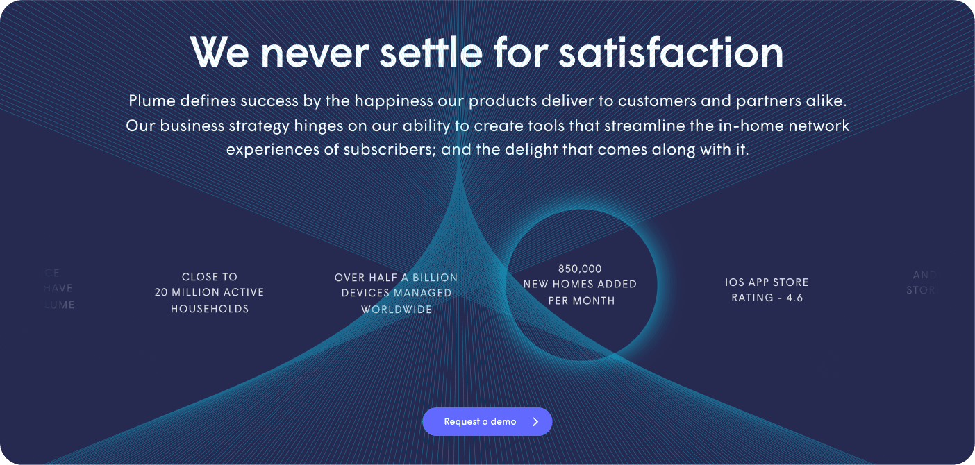
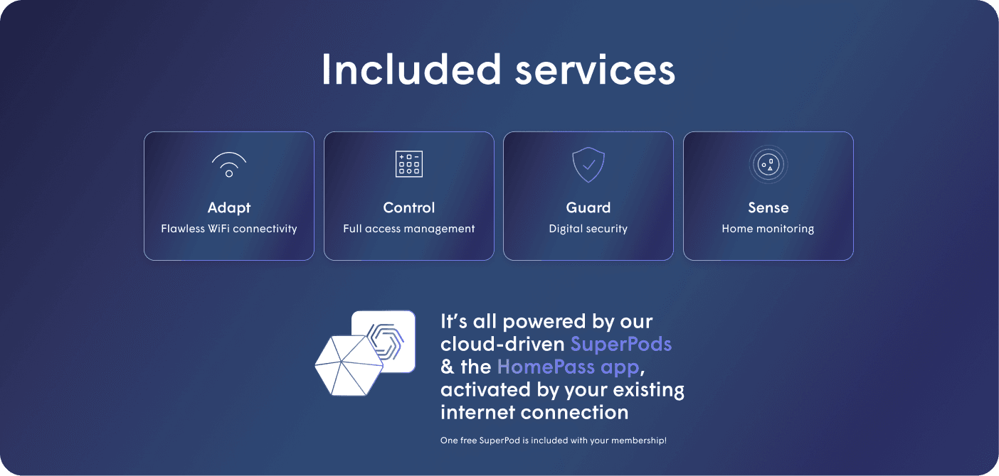
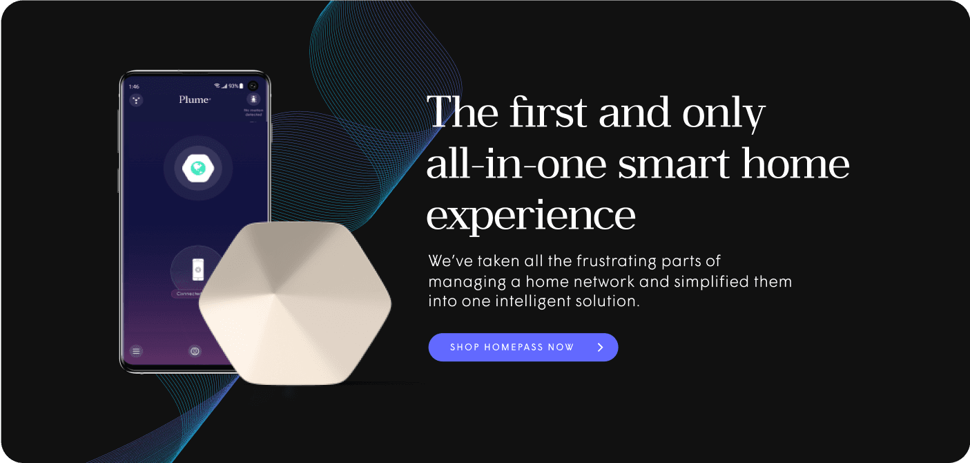
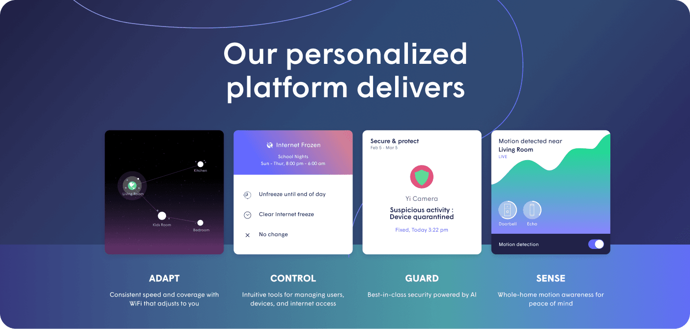
Plume is a Silicon Valley-based startup creating cloud-controlled, software-defined WiFi solutions for homes, businesses, and ISPs. Their subscription-based services include features such as enhanced connectivity, network monitoring, and advanced security capabilities.
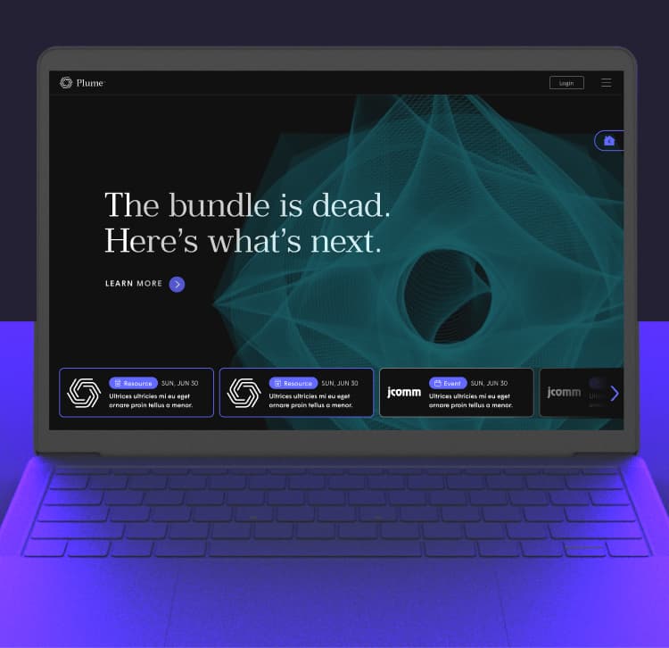
When Plume began a process of accelerated international expansion, they asked us to revamp their websites for scaled-up ecommerce operations. We adopted a strategy of continuous improvement, targeting areas such as translation management, theming flexibility, and overall performance.
A Strategy of Continuous Improvement
To facilitate international localization, we set up a new translation management system that vastly reduced the amount of data entry necessary to create region-specific pages.
International Localization
International Payments
As Plume expanded overseas, their shop required upgrades to better handle international payments. We helped Plume adopt a new ecommerce platform capable of calculating and displaying country-specific tax information at checkout.

Different areas of Plume’s website use different design themes. Applying these themes to new site content often required developer involvement, leading to higher costs. To make the process more efficient, we created a system of reusable content blocks that can be easily customized with the site’s various themes.
Flexible Theming
As Plume scaled up, new content and UI elements were constantly being added to the site. To facilitate these updates, we gathered all of Plume’s styles, templates, and components into a unified design system that serves as a consistent visual language across all of Plume’s products and channels.
Design System
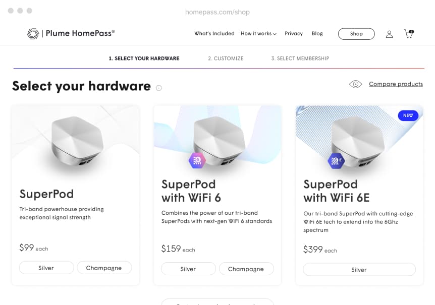
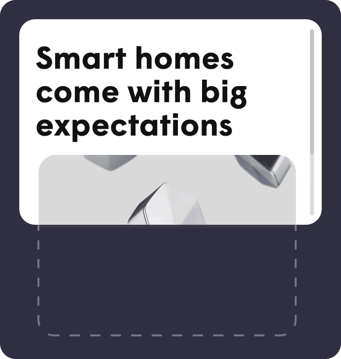
Shop UX
Plume’s subscription-based approach to WiFi is a new kind of offering, and it's always a challenge to convince consumers to try an unfamiliar product.
To improve conversion rates, we user-tested and remapped the shop UX to better educate customers about Plume’s hardware and membership options.
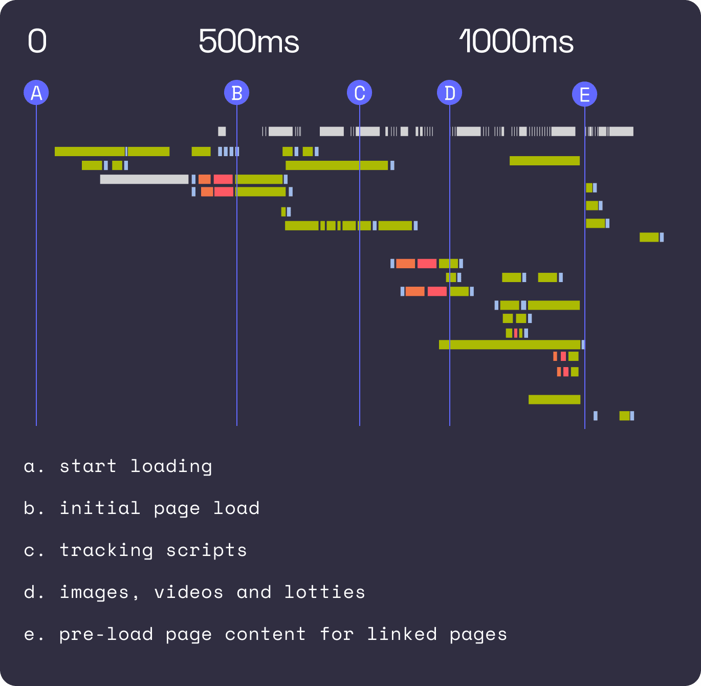
Load Times
The added weight of all the new content being added to Plume’s website was leading to larger payloads and slower load times.
To improve performance, we migrated the front-end codebase to a Next.js framework. This allowed us to split the code into separate bundles so that individual elements could load separately, leading to faster load times.
Google Lighthouse is a tool for measuring a website’s performance, accessibility, and SEO. Websites with high Lighthouse scores appear higher on Google’s search engine results
Lighthouse Scores
Performance
Accessibility
Best Practices
SEO
Lazy Loading
By delaying the loading of media assets until they are actually needed, this technique saves system resources, resulting in faster load times.
Semantic HTML
We used semantic HTML markup to improve the site's crawlability, leading to higher search engine rankings.
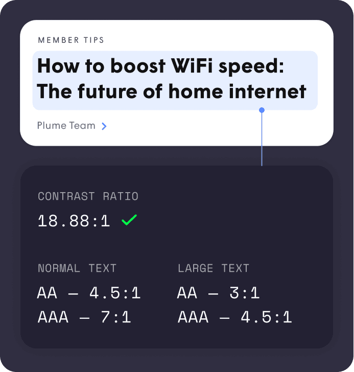
Accessibility
We improved Plume’s site to make it more compliant with WCAG accessibility standards.
Our strategy of continuous improvement has made Plume’s ecommerce system faster and more customizable, leading to higher conversion rates and search engine rankings. Our collaboration with Plume has grown into an enduring partnership.


95/100 Lighthouse Score
For entire ecommerce site
350% Higher Conversion Rate
6 months after launch
$300M Investment
Led by SoftBank Vision Fund 2
Ready to level up your Ecommerce capabilities? Let’s talk