

Figo
Redesigning a website to boost a pet insurance brand
Scope
Website
About
Figo is a pet insurance provider offering an innovative approach designed to take insurance out of its overly complex and unrelatable world and into the homes of everyday pet parents.
Overview
Figo needed to refresh their brand to highlight their welcoming approach to insurance. They also needed to update their website to better reflect their brand identity, improve accessibility, and drive conversions. For this project, we partnered with our friends at Someoddpilot. They focused on branding while we designed and built the new website.
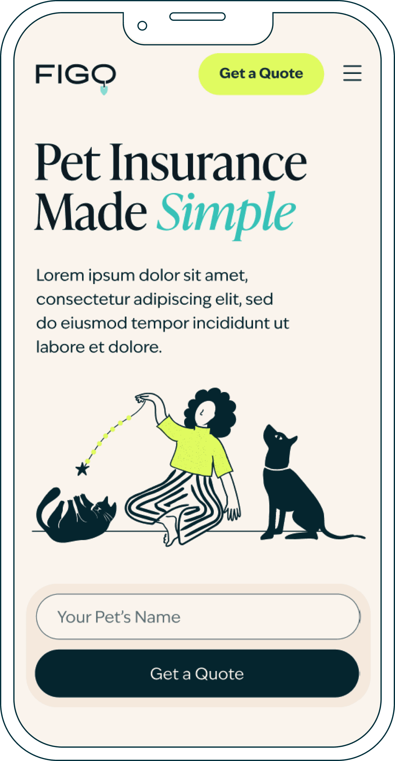

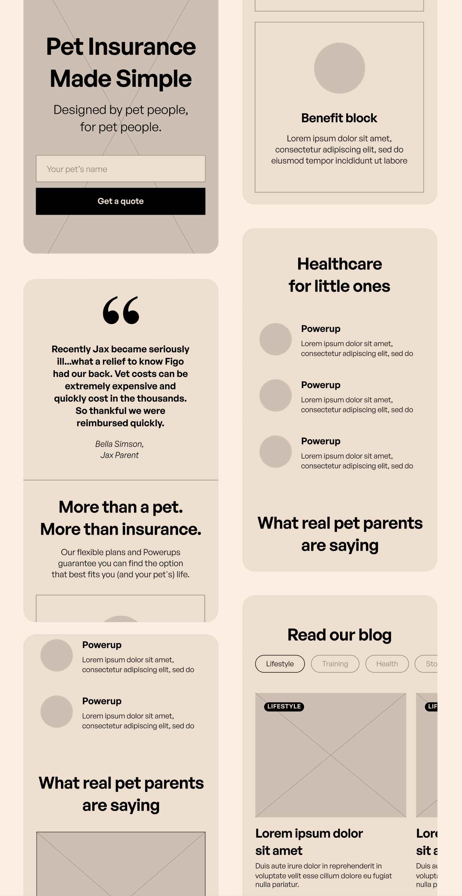
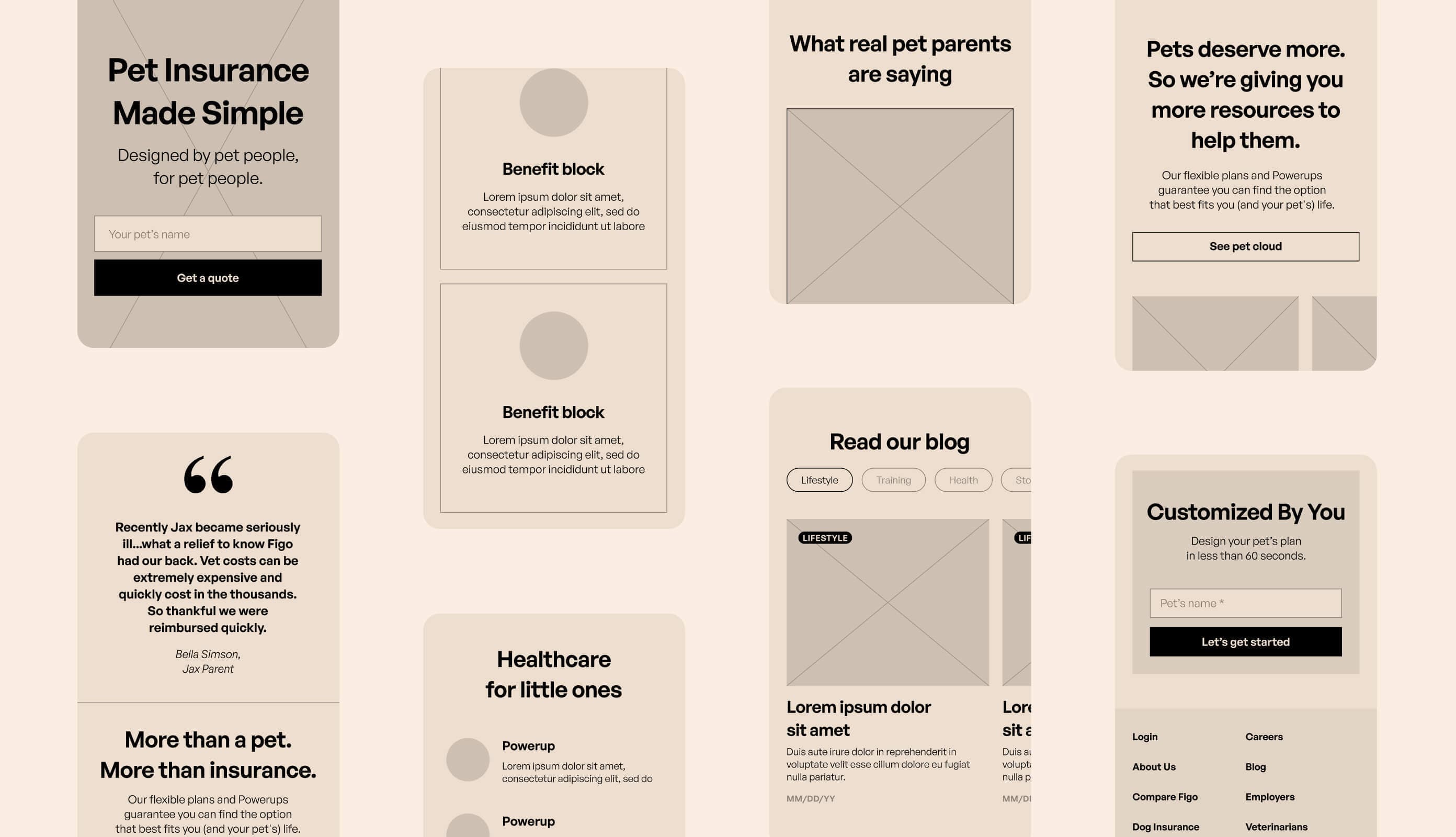


Figo’s goal was to create a friendlier, more engaging user experience. We mapped out and tested several versions of the site’s user flow, simplifying its structure and realigning all content to seamlessly guide the user to sign up for a quote.
UX

Creative Direction
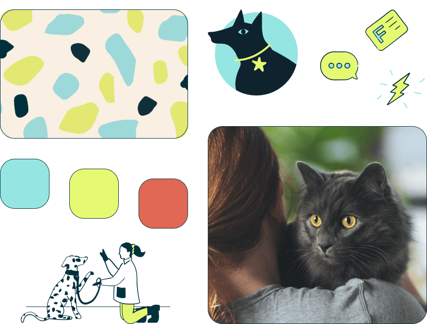
For the site’s look and feel, we went with a palette of cheerful turquoise and lime yellow tones, and chose a light beige background to add a sense of warmth. The layered, irregular layout and simplified tortoiseshell pattern create a casual, homespun feel with playful illustrations scattered throughout.




Design System
Once we defined the site’s overall design theme, we took all colors, typefaces, icons, toggles, etc, and gathered them into a design system: a guide to help make sure all reusable elements and styles are applied consistently across the site.


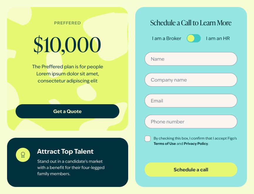


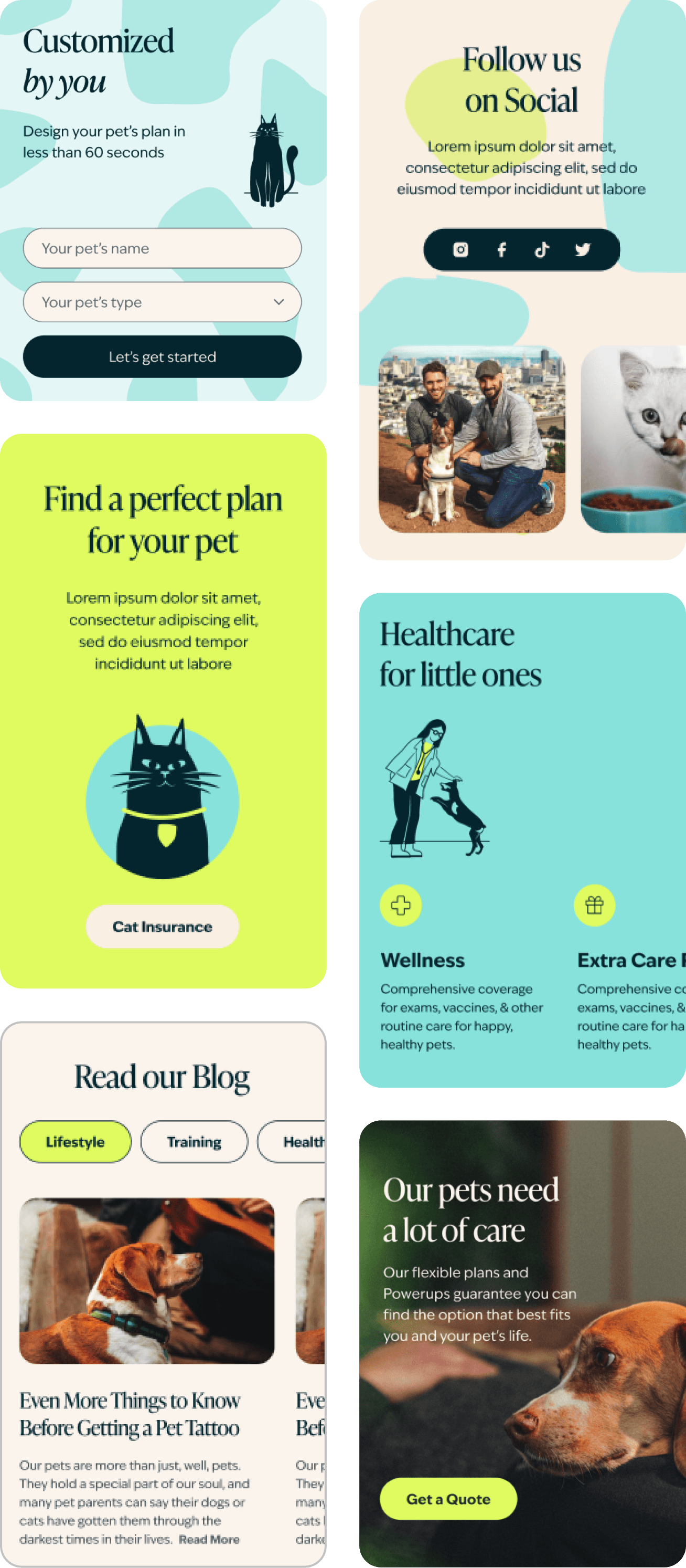

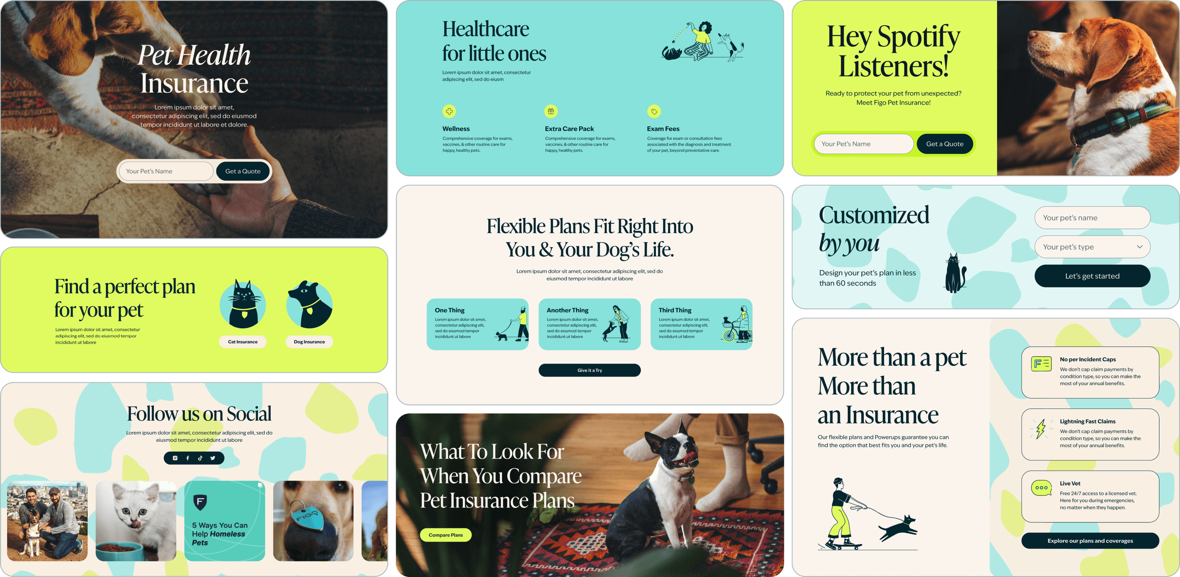


Our design process is fine-tuned for block-based web development. Rather than designing page by page, we create customizable segments or ‘blocks' that can be arranged in different sequences to build each section of the site. This modular approach speeds up development and makes it easier to create and edit new content.
Design Blocks
Claim Calculator
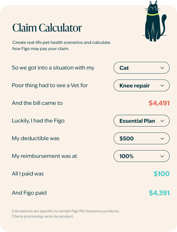
One of the site’s most unique features is the claim calculator, which allows users to create real-life pet health scenarios to find out how Figo can help reimburse veterinarian costs. The step-by-step process makes Figo’s offerings easier to understand, making benefits, claims, and reimbursements more relatable by framing them around the user’s personal experience.


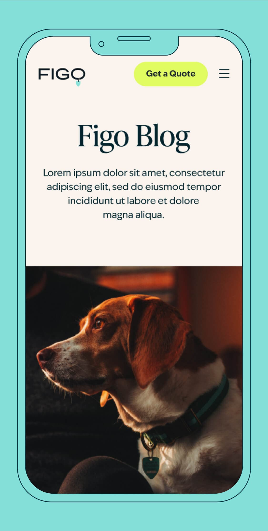
A key part of Figo’s strategy is to offer quality content to attract a broad audience of pet parents. We redesigned Figo’s blog to reflect their updated brand and included an all-new system of tags and categories for better navigation. We also upgraded the blog’s content management system to support a wider range of formatting options and media types.
Blog

Accessibility
We always strive to meet the highest standards of accessibility. This was particularly important in the case of Figo, which as an insurance company must comply with the strictest web content accessibility guidelines. At each step of the process, our team used accessibility auditing tools to make sure all requirements were met.
.png&w=1920&q=75)
.png&w=3840&q=75)
.png&w=3840&q=75)
.png&w=3840&q=75)
.png&w=3840&q=75)
.png&w=3840&q=75)
Working alongside SomeOddPilot, we created a website that truly captures the spirit of Figo’s brand. Its simplified designs, streamlined navigation, and improved accessibility reflect Figo’s uniquely user-friendly and inclusive approach to pet insurance.


Need a powerful website to amplify your brand strategy? Let’s talk